If you were tasked with illustrating of the concept of wisdom, where would you start? You may immediately begin to visualize a monk meditating or an elderly person quietly reflecting on their life. But these images don’t tell the whole story. Wisdom is a dense topic and open to many interpretations.
Andrea Pemberton, the Rubin Museum’s Creative Head of Graphics and Branding, had to address this dilemma when planning for the Museum’s fall program series focused on the topic of Wisdom. The end result became known as “The Wisdom Matrix,” a graphic design seen everywhere from the Museum’s website to the subway platforms of New York. It’s also the namesake of the 2016 fall series.
We asked Andrea a few questions about the process of bringing the idea of wisdom to life:
Graphically representing wisdom sounds tough. How did you feel about the task?
I was excited when my colleagues announced that “wisdom” would be the theme for the Rubin’s fall series of on-stage conversations and programs. When one of the tasks on your to-do list is “visualize wisdom,” you know you have a great job! Designing the visual identity for a program series at the Rubin is always a dynamic and collaborative process—and not without its challenges!
How did the concept of the Wisdom Matrix come about?
My team and I first heard from Tim McHenry, the Rubin’s Director of Programs and Engagement, and his intention for the program series, which we knew would be focused on the broad topic of wisdom. Then we followed up by meeting with members of other departments to discuss everyone’s concepts, opinions, and even favorite quotes about wisdom.
After these conversations, I needed to imagine how our visitors would experience the series. Although I didn’t yet know who would be participating in the on-stage conversations, I needed a way to consider what an audience member might take away from a conversation about wisdom. Because each of the participating speakers will inevitably come from different walks of life and perspectives, I began to envision a web of interconnected specific “wisdoms,” rather than one big generalized one. From these distinct wisdoms—wisdoms of experience, of innocence, of instinct, of logic, of love, of intuition—I formed the idea of a “wisdom matrix” that could reconstitute, evolve, and grow in response to specific conditions and the needs of a particular moment, much like the way many people feel wisdom operating in their day-to-day lives.
Once you have an idea, how does that develop through the creative process?
As part of my process, I created a moodboard, filled with images of different types of matrices to inspire me.


Visually, the matrix was beginning to take shape as a grid and it needed axes to determine the respective positions of each plotted “wisdom point.” I tried plotting the points on axes of “space” and “time,” but this proved overly abstract and left me staring off into the distance for long periods contemplating the nature of the universe!
I experimented with other types of labels like “mind/body/spirit,” which were more concrete and relatable than “space/time”—but it didn’t feel like a fresh idea. During a brainstorm session, one of my colleagues referenced this trinity as “head/heart/gut”—a more visceral, immediate, and embodied construct. With this slight reframing, the matrix found its way out of the abstract and into a more habitable realm.
The idea of a matrix seems abstract—how do you decide what it looks like?
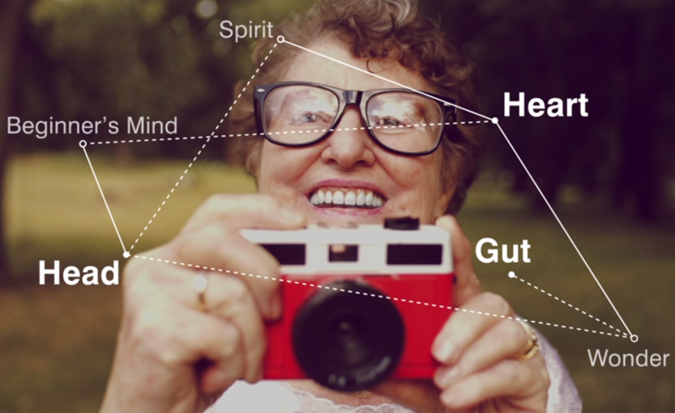
From “head/heart/gut,” I began to experiment with the shape of the matrix. The triad seemed to imply something balanced—an equilateral triangle?—but as I worked with symmetrical structures the matrix looked more like a Platonic ideal of wisdom than the embodied, visceral wisdom of real life that head/heart/gut implies.
The more random I made the structure, the more it felt like something one draws upon in daily life for discernment, judgment, and decision-making, something one can feel, live, and use.

To make the matrix less theoretical and more practical, I first layered it over various photographs depicting moments of decision making, and then more intimate moments of contemplating, learning, and acting: a close-up shot of a closed eye, a teenaged girl examining a structural model of an atom, a senior woman delighting in taking a photograph. We used all of these in succession for the video promoting the series, but for the printed materials, we had to choose a single image.
How did you get the final shot for the signature image?
We decided to use a close-up shot of a closed eye for the printed pieces. We landed on this because the intimacy of the macro shot, and the closed eye itself, help imply that the matrix depicts an interior process. After culling through hundreds of available photographs of closed eyes to no avail, we decided to take our own shot. Laura Sloan, Assistant Manager of Docent Programs, was one of the handful who participated in the up-close-and-personal shoot. Laura’s “face of wisdom” appeared on subway platforms throughout the city, on the series brochure cover, and in an advertisement in the New Yorker.

Where can I see more of the Wisdom Matrix?
We have installed wisdom matrices on the mirrors in all of our bathrooms, so museum patrons can take photos of themselves “inside” the matrix.
Dive deeper this fall and think about how you make decisions—do you use your head, heart, gut, or a combination of all three?
Add Your Thoughts
Comments are moderated, and will not appear on this site until the Rubin has approved them.


